 User Interfaces
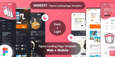
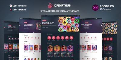
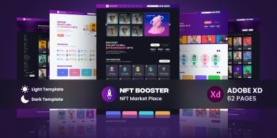
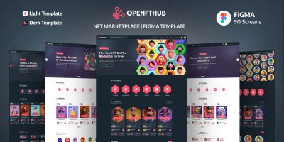
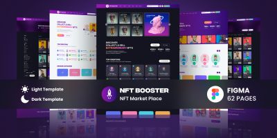
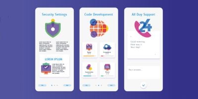
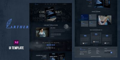
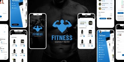
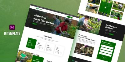
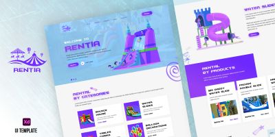
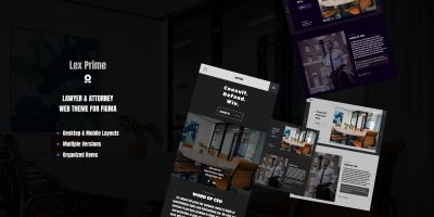
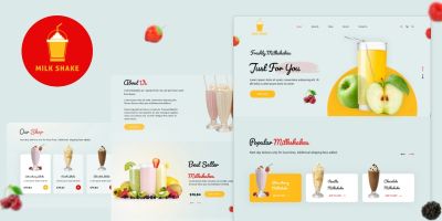
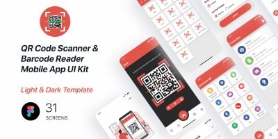
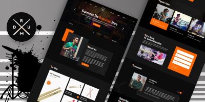
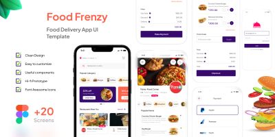
Browse 176 ready-to-use user interface graphics for your next project. Figma UI kit, mobile app UI, and dashboard UI ready to download. Ideal for mobile apps and SaaS dashboards, with files in Figma and Sketch. Customize fast, keep your visuals consistent, and ship sooner.


More about User Interfaces
If you’re putting together mobile apps or polishing a SaaS dashboards, the right UI kits makes the whole project feel more intentional. This collection brings together Figma UI kit, mobile app UI, and dashboard UI that you can drop into your workflow and customize without drama. Expect practical files in Figma and Sketch, plus previews that make it easy to compare styles. Whether you’re building for clients or shipping your own product, you’ll find options that look modern, stay consistent, and save you time.
Looking for a broader set? Start at Graphics, or jump to User Interfaces, Icons, and Logo Templates for a full visual system.
What you’ll find here
- Figma UI kit and mobile app UI designed to stay readable at real-world sizes.
- Files in Figma / Sketch so you can tweak colors, layers, and typography.
- Styles that work for mobile apps and SaaS dashboards — from clean and minimal to bold and playful.
- Assets that pair well with related categories like Icons and Logo Templates.
- Useful variations such as landing page UI and UX UI design for common project needs.
- Community-made downloads that are easy to compare using sorting and filters on the page.
Where to use these assets
Creators use UI kits for everything from quick prototypes to polished releases. These are especially useful for:
- mobile apps
- SaaS dashboards
- landing pages
- admin panels
- prototypes
- design systems
Formats & compatibility
Most downloads are delivered in familiar formats such as Figma, Sketch, Adobe XD and PSD. That means you can edit in your preferred tools and export exactly what your project needs. UI kits often come with components, symbols, or styles — check for reusable buttons, inputs, and navigation patterns.
A quick selection checklist
A small checklist goes a long way: does it scale well, does it read at small sizes, and is it easy to tweak? For templates, pay attention to grids and typography hierarchy. For graphical assets, check if layers are named and grouped logically. And if you’re buying for a team, pick a style that can carry through future pages and screens without looking out of place.
Quality checklist
This stuff is easy to skip when you’re in a hurry, but it pays off. A two‑minute check now can save an afternoon of fixes later.
- Open the source file once before you commit — it’s the fastest way to spot messy layers or missing assets.
- Check for consistency: spacing, alignment, and style details should match across the pack.
- Make sure text is editable (or easy to replace) and key elements are grouped logically.
- Look for component thinking: buttons, fields, and cards should be reusable across multiple screens.
- Test contrast quickly (especially for primary actions) so the UI stays readable.
Workflow tips
To keep things tidy, create a small “assets” folder per project (and keep the original download untouched). Make edits in the source format, then export only what you need for the build. If you’re working with vectors, export to SVG for crisp scaling; for raster assets, keep an eye on pixel density and compression. A quick naming convention (like `ui/button_primary` or `icons/outline/settings`) also makes future you very happy.
Practical tip: Before committing to a kit, try a quick “screen swap” — drop your real copy into the headline, buttons, and form fields. If it still looks balanced, you’ve got a strong base for your UI. If not, pick something with more breathing room.
FAQ
- Can I use these for mobile and web? Yes — many UI kits are designed around responsive grids and reusable components.
- Do you have Figma-ready files? A lot of UI downloads include Figma, Sketch, XD, or PSD sources. Check the item details.
- How do I keep screens consistent? Pick one kit, define spacing + typography, and reuse components across the whole app.
Related categories on Codester
- Graphics marketplace
- Icon packs
- Logo templates
- Product mockups
- App templates
- Website templates & themes
Learn more
Want to dig deeper or align with common conventions? These references are handy while you customize:
Browse the files, filter by popularity or newest releases, and grab something you can ship with. If you’re assembling a full stack for a project, pair this category with related graphics and templates so everything feels cohesive. And if you’re new to Codester, check the other categories — you’ll often find complementary code, themes, and plugins that speed things up even further.